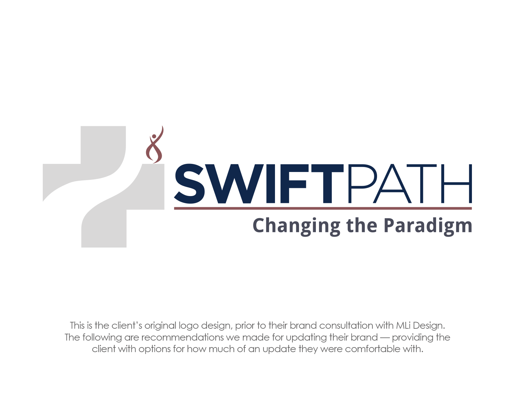
The SwiftPath Program delivers state of the art hip and knee replacements by helping patients find specialty trained surgeons, who use the most advanced techniques in joint replacement surgery.
Below is a step by step presentation of concepts we did for SwiftPath, to show them how they could bring an updated look to their image while maintaining the original integrity of the brand.
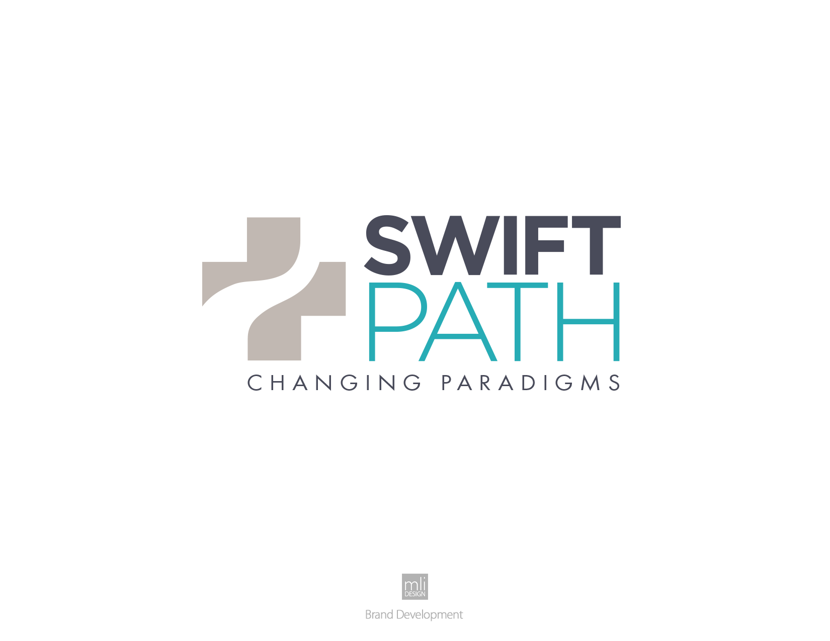
A) First, we concentrated on simplifications by removing unnecessary elements and suggesting a more current font for the tagline. We also gave the second half of the name the secondary color that was part of the original brand palette.
B) Introducing a more current color palette that’s also more related to their medical field, then shifting the tagline flush-left to eliminate the gap.
C) In the final option, we pull the design together into a tighter unit and make some final tweaks to the palette and font treatments.
D) Lastly, we show some optional ways the new brand can be used with photography in their marketing.